Next Step Application
OVERVIEW
“How might we deliver encouragement and knowledge about programs for our users in order to help them get started on pursuing their passions?”
In this project I was tasked with creating a product that would help users find a program to start a new career path.
Approach
When approaching this project I followed the 5 stages of the Design-Thinking Process. The design thinking process is not as linear as it may seem; the steps overlap and repeat themselves to be extremely useful in finding the users' needs and testing throughout the process.
In conjunction with the Design-Thinking Process, I implemented a UX Design Process which you will follow below in Process.

“I don’t know what to do with my life.”
-Quote from User Interview
PROCESS
EMPATHIZE
RESEARCH OUTCOMES
Survey
To understand what a person whom is making a career change considers when choosing a new path, I sent out a simple Google forms survey. I wanted get a broad overview of their pain points and needs when making such a big decision.
Focus Group
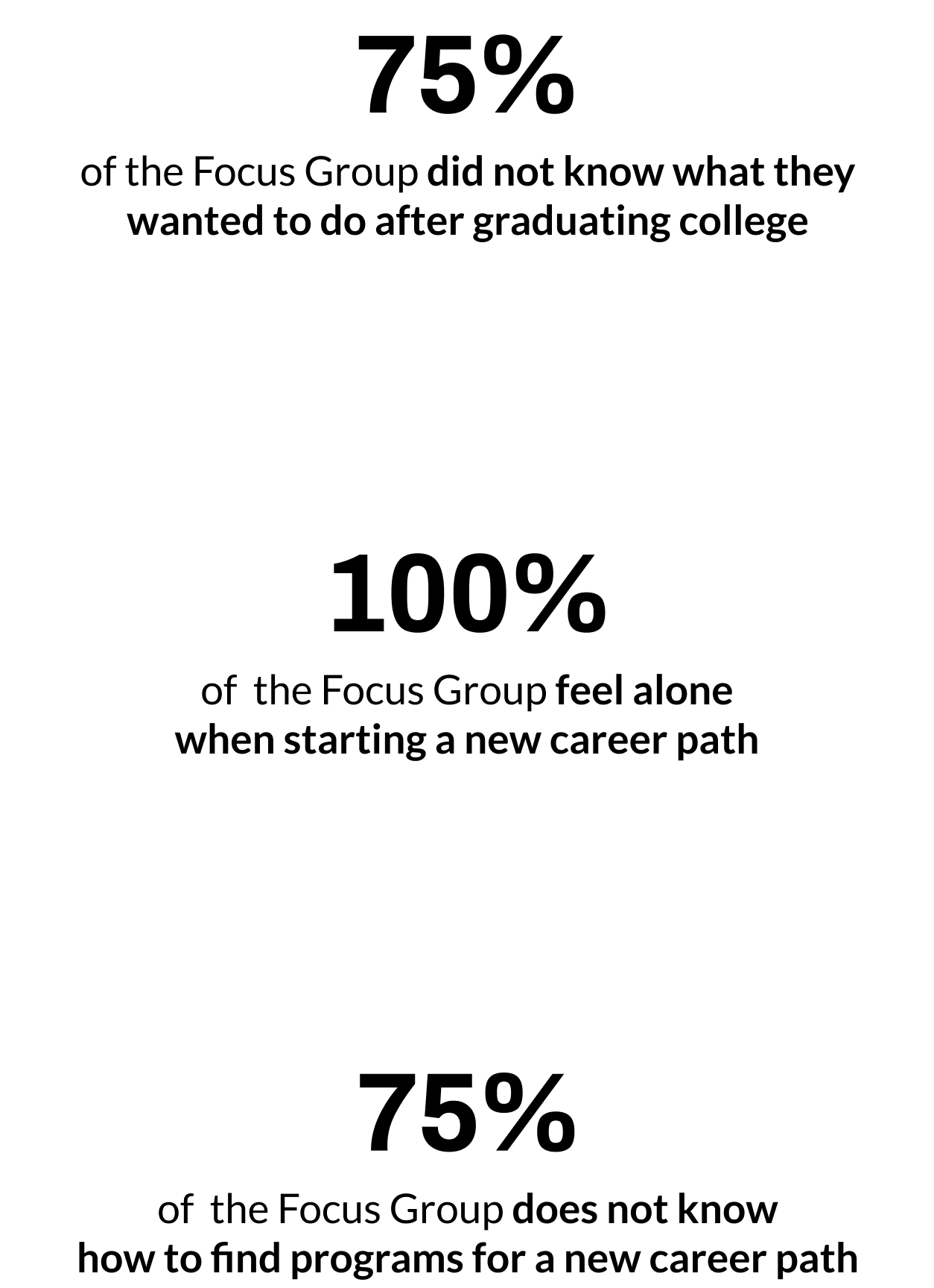
After getting a broad overview of my target audiences pain points and needs, I dove deeper by gathering a group of two people who have recently made a big career change and two people who are considering making a big career change. The goal of this focus group was to gather pivotal insights of the users' values, perceptions, and experiences. This was a crucial part of my research to begin affinity mapping and sort out all of the information that I had gathered.
DEFINE
2. STRATEGY
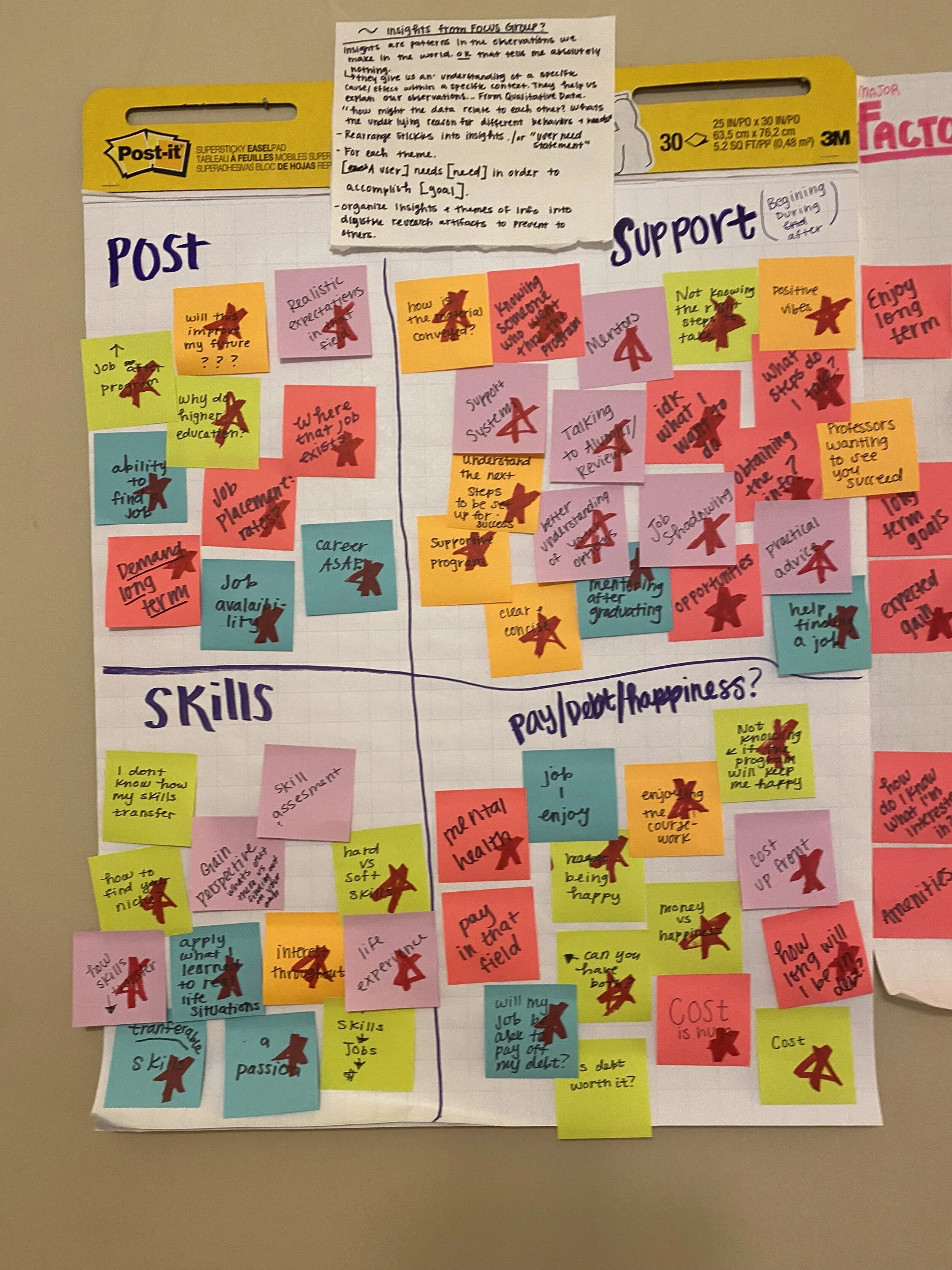
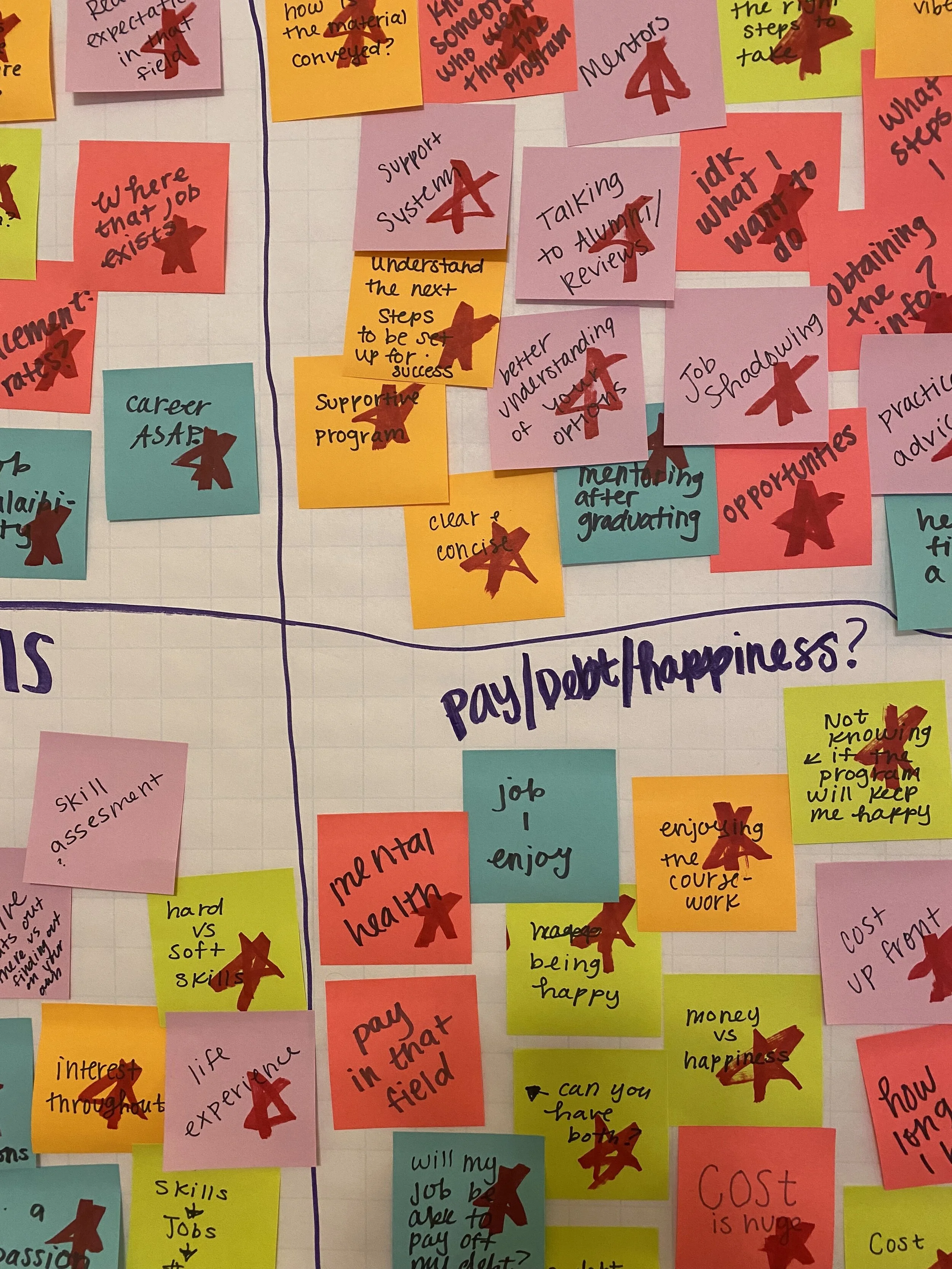
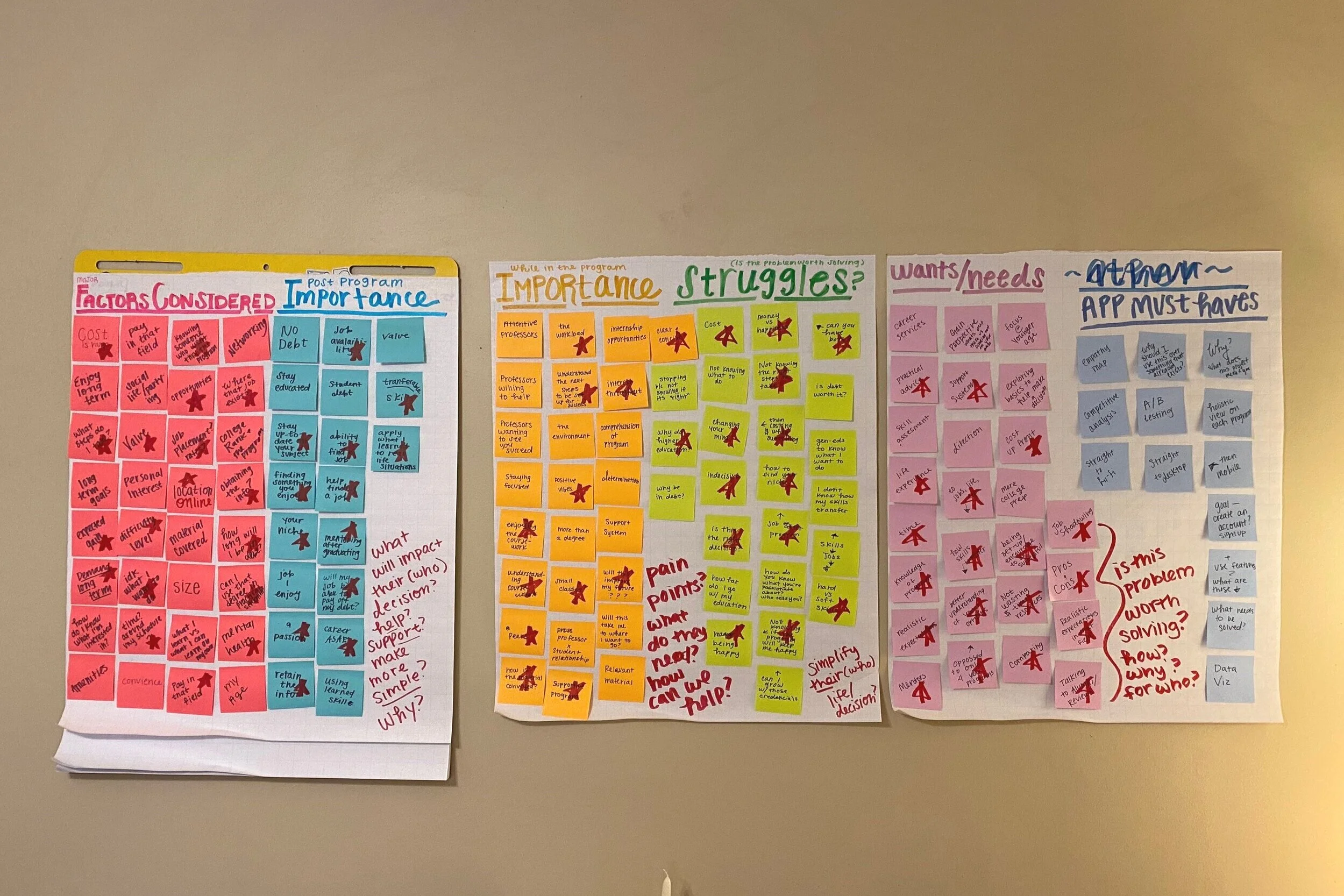
Affinity Mapping
Affinity mapping helped me make sense of all of the information I have gathered from the survey and focus group by physically writing down everything and sorting it out. Affinity mapping makes me really listen and read every response and take in what people say, internalize it, and put a label to it. Actually seeing all of this information on one wall together helps me make sense of what it all means to me, personally, and come up with the best solution. Having all of this information on sticky notes is great, as I am able to move those ideas around, group similar themes, and draw connections throughout all of the information. For example, I didn't think mental health and cost up front of a program would ever have so many connections and lead to someone’s long term happiness, but that was a huge theme and something people really care about.
After affinity mapping some new questions I have are, “How can I make the user feel supported throughout such a tough decision?” “What makes someone feel supported?” “Why does someone want support?” “Why do they need so much support?” “Why is this such a difficult decision?”
User Needs
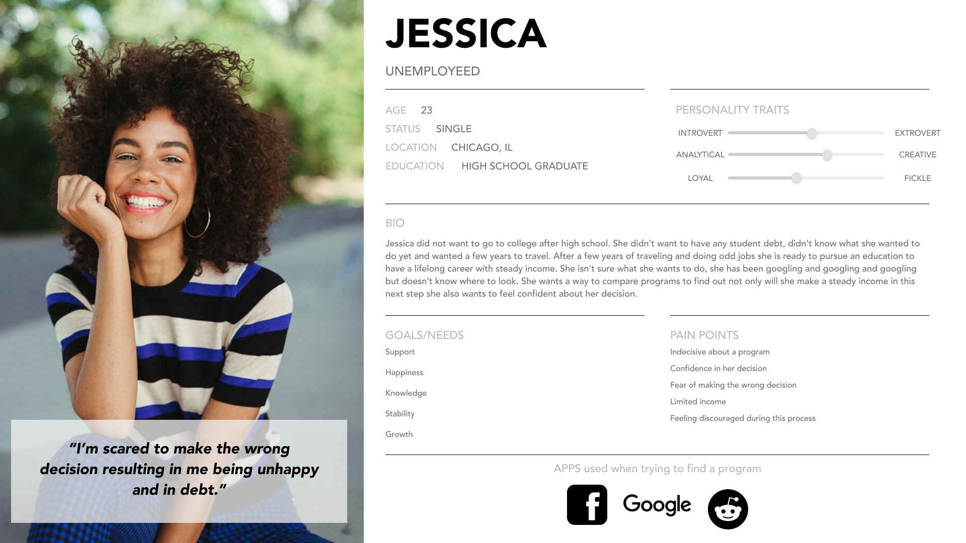
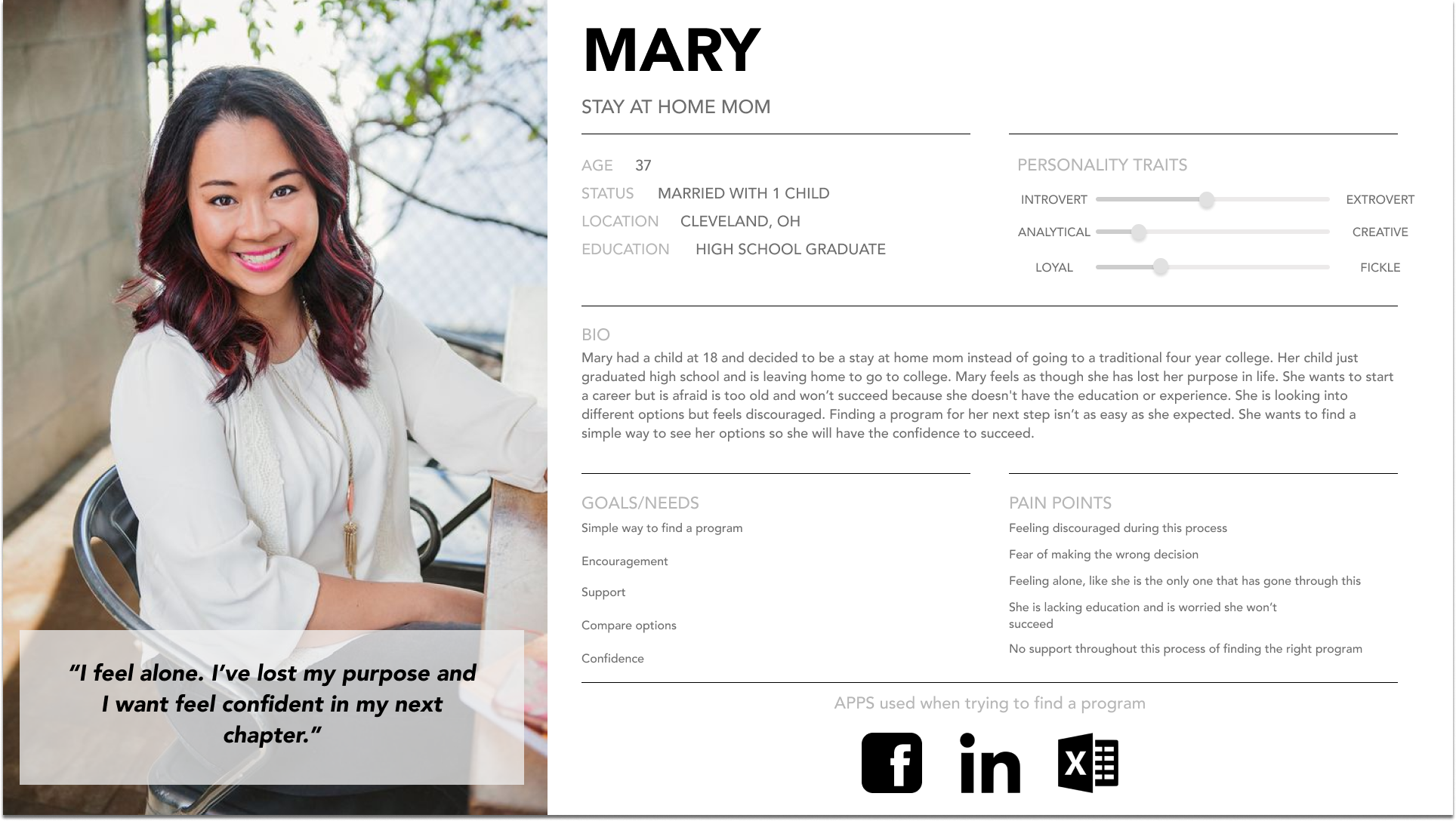
Based on information from insights during research and affinity mapping, an empathy map and personas were created to reveal user needs and pain points to help guide me in creating a design.
Empathy Map
I created an empathy map in this stage of strategizing because I wanted to further explore and prioritize my users needs. With so much information gained through affinity mapping, this step was crucial in seeking my users emotions when making such a difficult decision. I based my empathy map on the situation, “Person did not go to college and wants to find a course to take so that they can start a new career path.” I felt more connected to my users by seeing the problem from their perspective.

* My AHA! moment
Creating an empathy map was my moment of sudden moment discovery for me because I felt I could empathize with my users. The empathy map helped me see how big of a decision choosing a new career path was to my users and how a person is reacting to this decision. This step was significant in making personas and the bones the product. I now felt more connected to my users and went forward with their emotions first in mind.
Personas
Creating personas was extremely helpful in creating this product and remembering who exactly I am designing for and empathizing with the user I decide to do three because at this step, I still had too much information and personsas helped me see the problem from a users perspective. By creating three personas I saw what users had most in common for example each persona had the goal/ need of support when taking the next step in their career, so I knew that was a huge priority going forward.
Pain Points
Not knowing their options
No support
Feeling discouraged
Unable to find details about options
Networking is difficult
Wants/ Needs
Support before, during and after of their decision making process
Major factors people take into consideration all in one convenient place
Knowledge of what is available
Ability to connect with others going through a similar situation
Problem Statement
“Our individual, who wants to pursue a new career, feels discouraged when choosing a program. Our solution should deliver encouragement and knowledge of programs to help users get started in pursuing their passions.”

“I am interested in a few different subjects. I can’t pick anything specific because I don’t know where to start.. “
IDEATE
Sketching
Next, I began sketching, with user needs being my top priority. Next Path is a product that will provide knowledge, support and necessary steps to confidently pursue their next step in life.
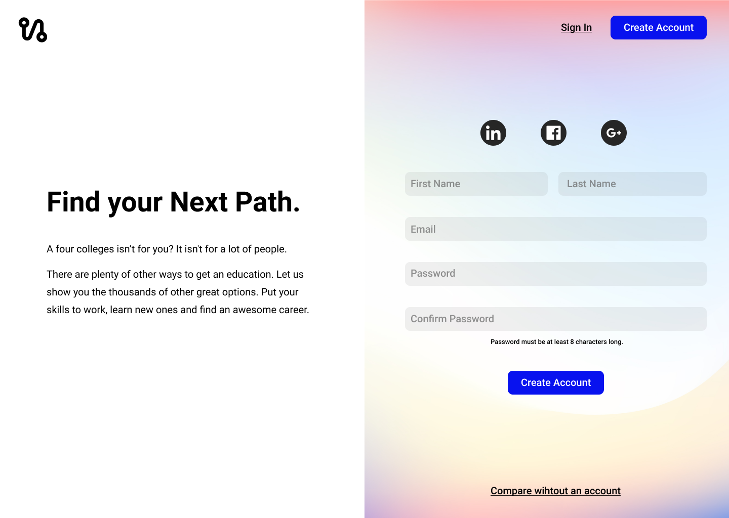
“A four year college program isn’t for you? It isn't for a lot of people. There are plenty of other ways to get an education. Let Next Path show you the thousands of other great options. Put your skills to work, learn new ones, and find an awesome career.”
DESIGN
3. WIREFRAMING
After sketching I began creating wireframes of the product to conduct A/B testing. For each screen I took detailed notes on what was preferred, what I thought would be the preferred version, and why I thought that version that was most popular was most popular. The goal was to improve crucial screens early in the process and use that information to better my design throughout. After testing, I learned my users were more drawn to blue buttons vs aqua buttons, this color choice was key throughout the product. I also learned, if given the information up front, such as, creating as text boxes to create an account upon landing on the product, the user is more likely to create an account vs continuing through the product without an account.

PROTOTYPE / TEST
4. A/B TESTING
Once my screen were complete I began A/B testing. I decided to do A/B testing so I could get an early reading of what was working with users. I tested buttons, colors and layout. These were huge decisoning factors in the success of the product for example button color, which button was more likely to get s user to create an account for the product vs continuing through the product without signing in. This was key because I want a user to create an account by learning early on what color is more attractive to users can determine where I can guide them throughout the design. In this particular situation users preferred the dark blue buttons as they said it caught their eye more, users also prefered a home screen where text boxes were provided to create an account vs pressing a button to create an account. A/B testing had a huge impact on the design going forward.
6. FINAL PRODUCT
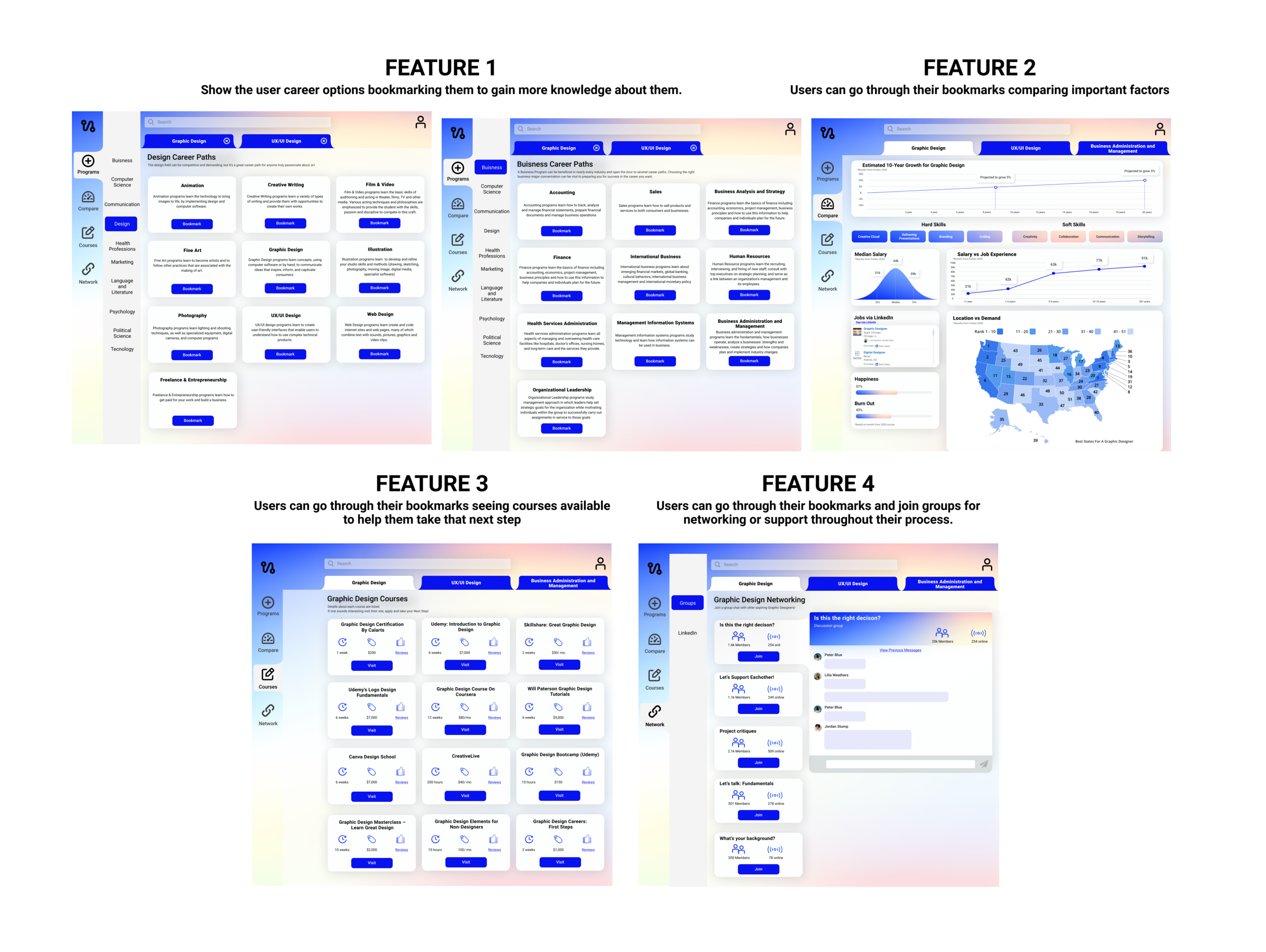
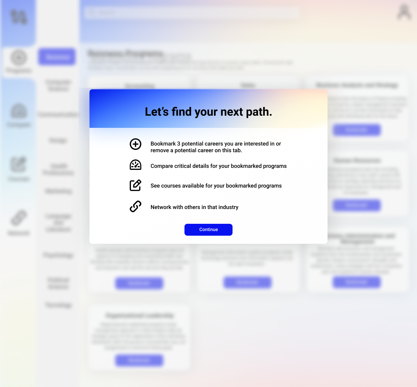
Four priority product features
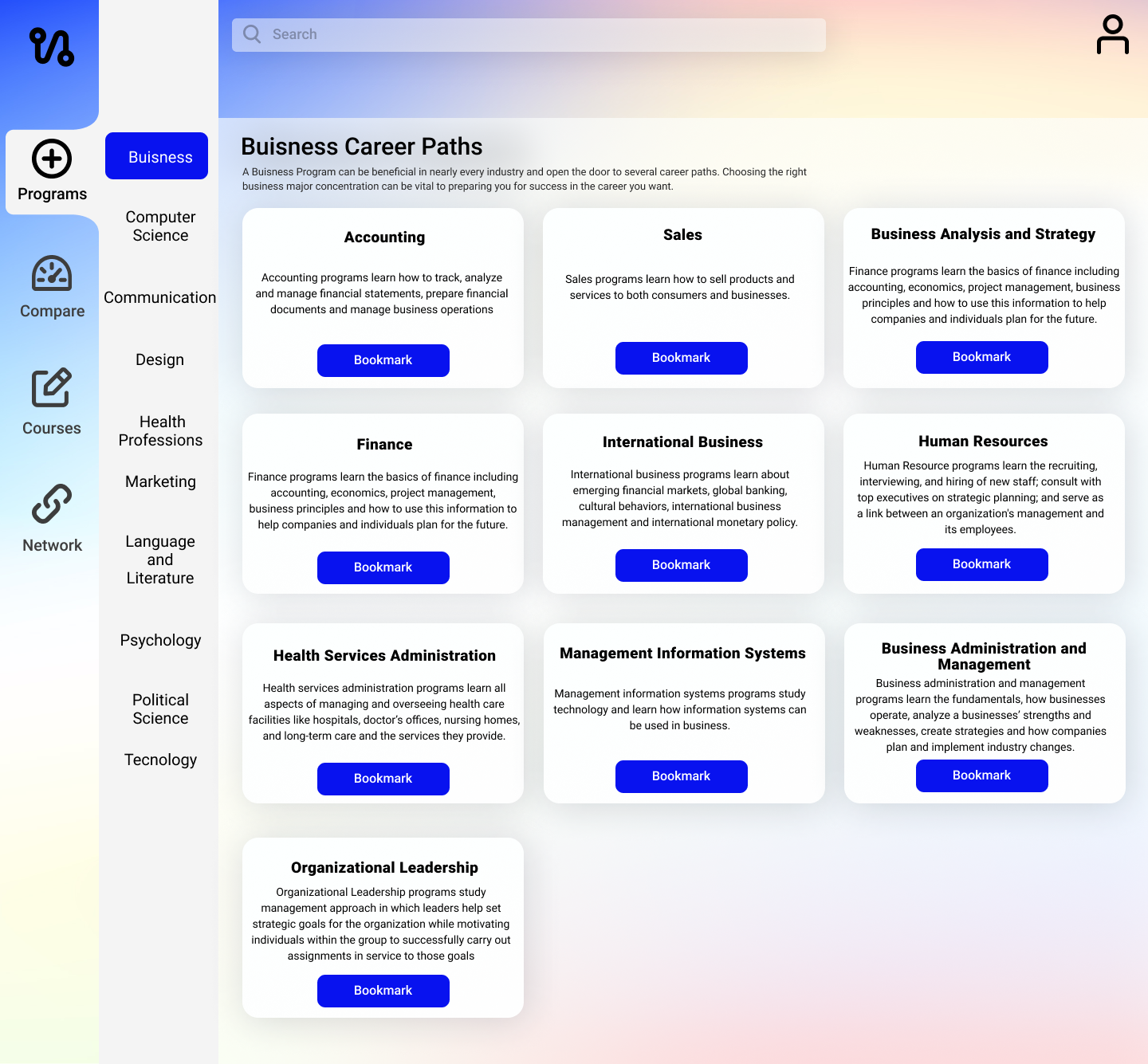
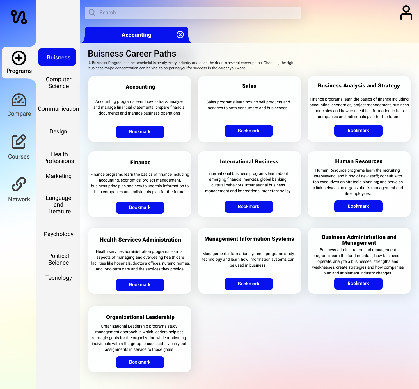
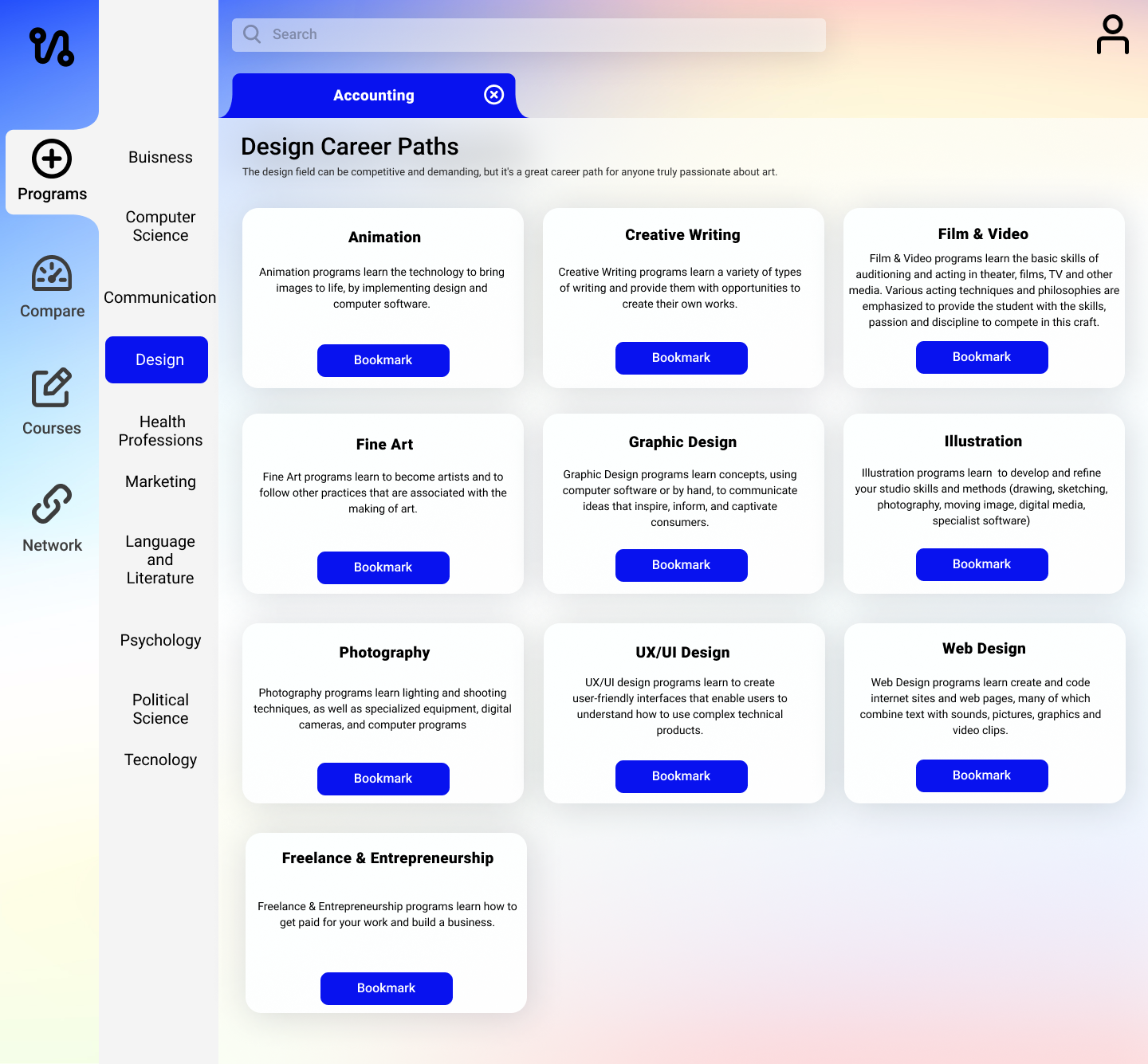
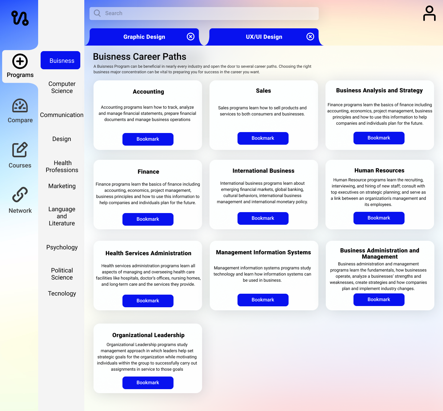
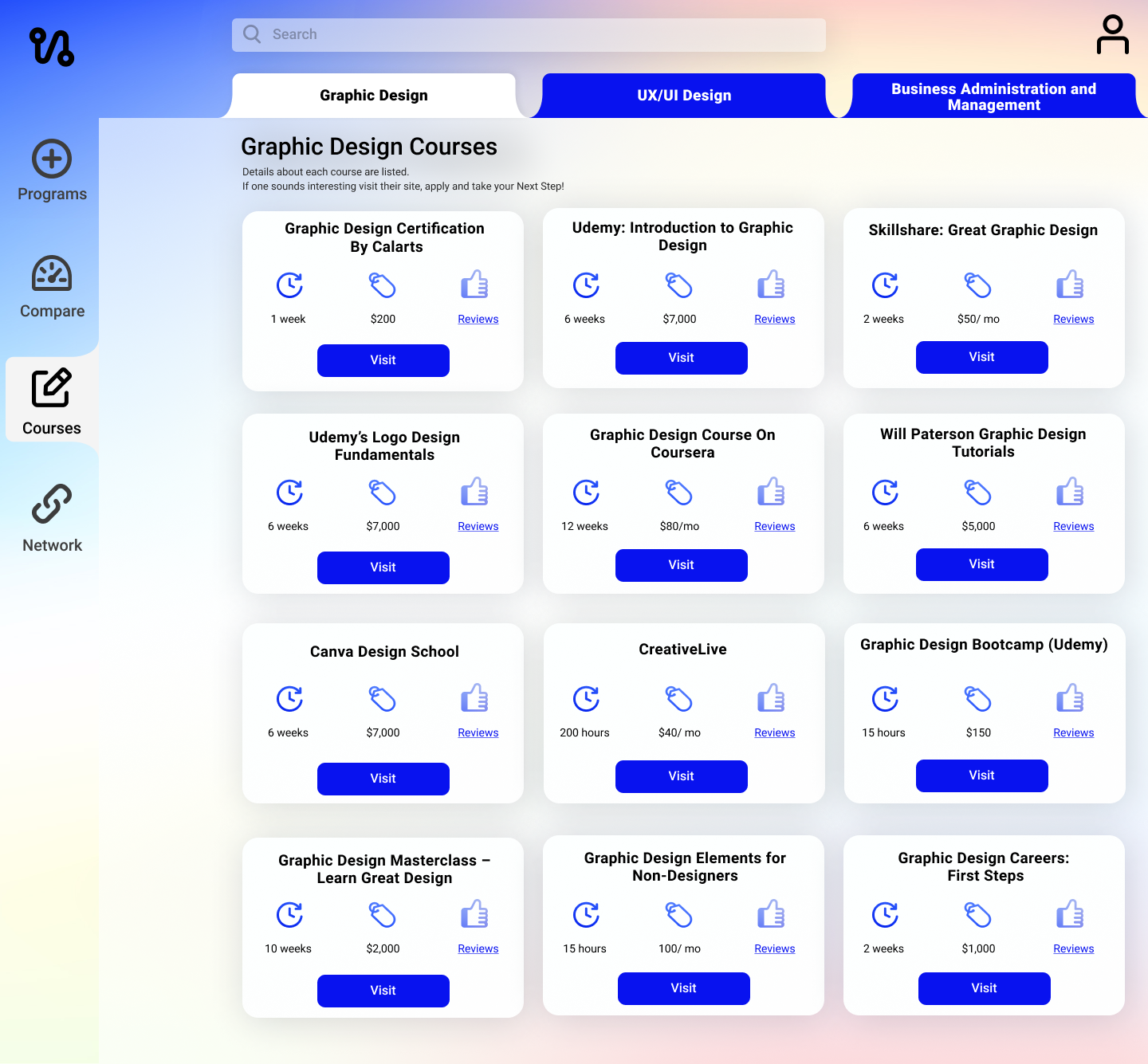
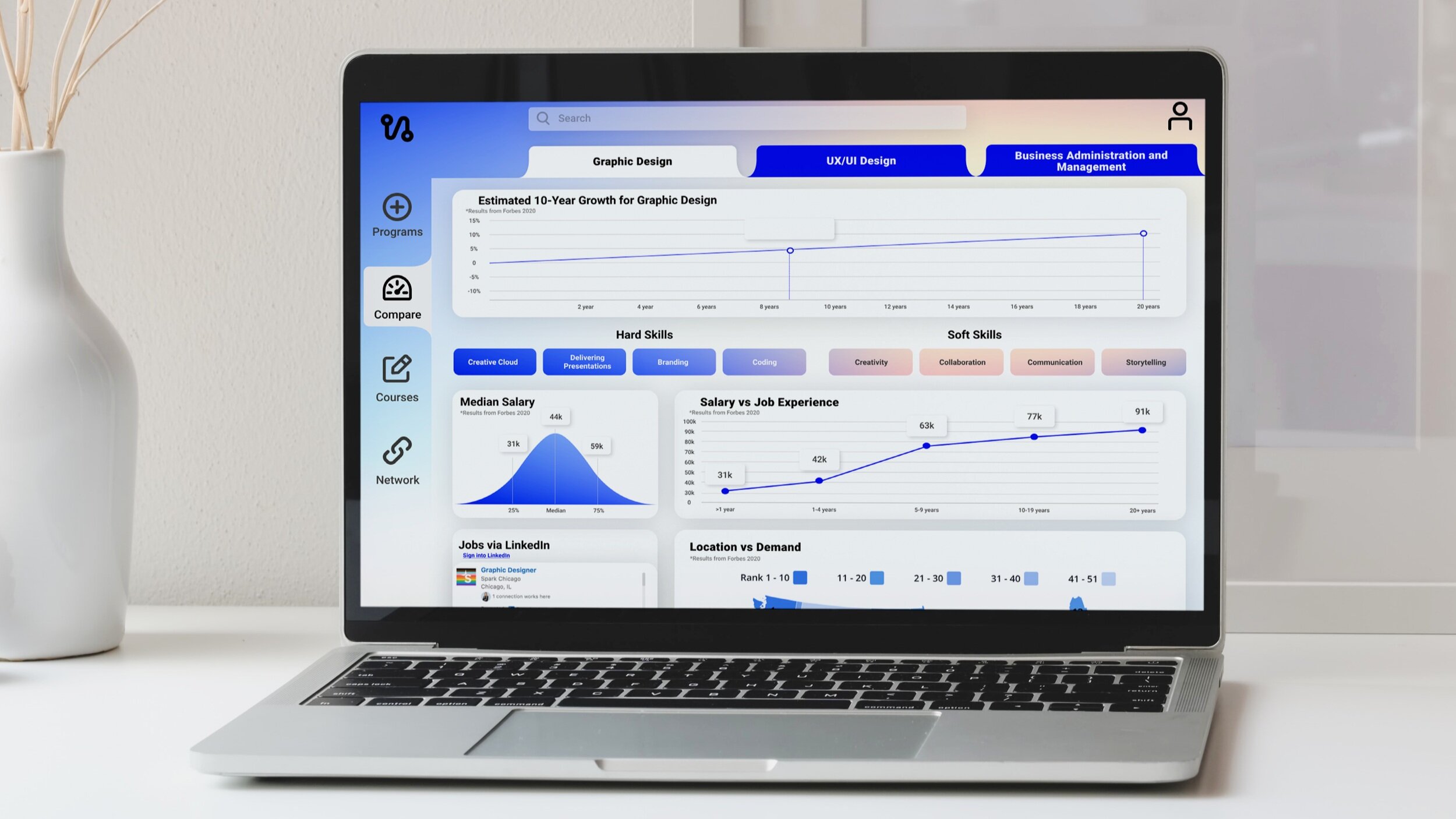
Show the user career options, which can be bookmarked to gain more knowledge about them.
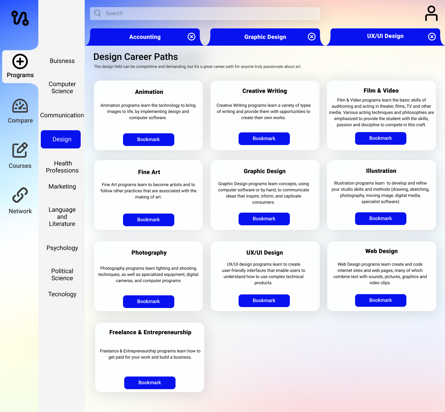
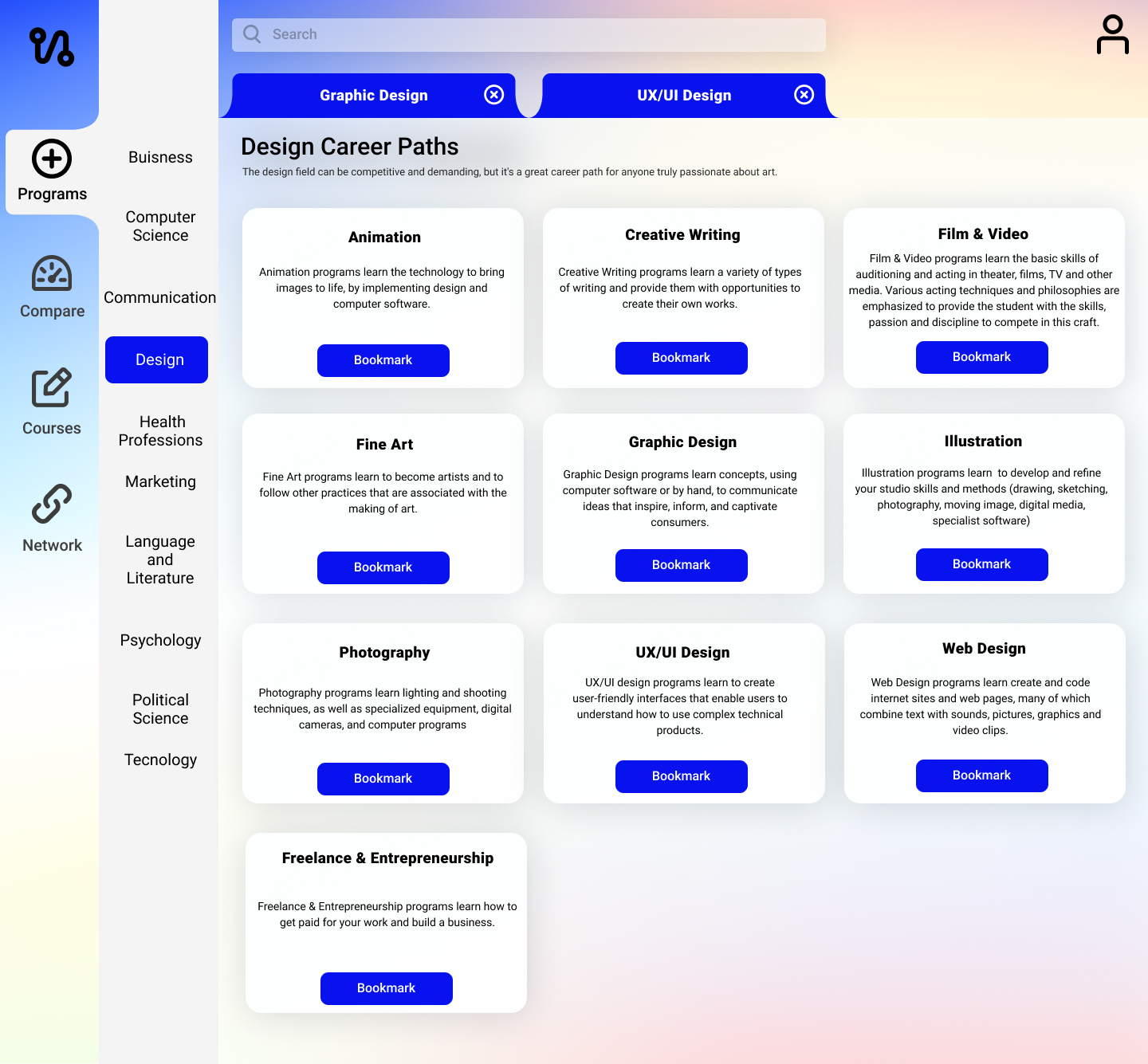
Users can go through their bookmarks, comparing important factors
Users can go through their bookmarks, seeing courses available to help them take that next step
Users can go through their bookmarks and join groups for networking or support throughout their process.
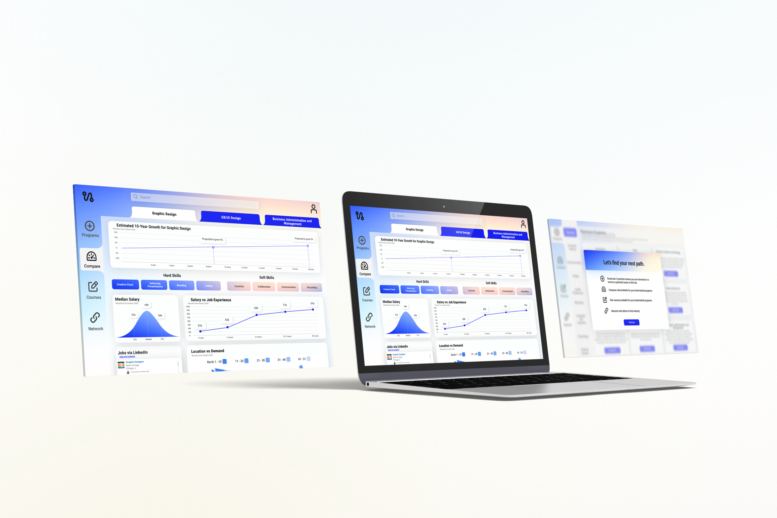
Desktop Product
Mobile Product

“Next Path would be extremely helpful and make me feel a lot more confident, I wish it was available sooner. This shows me factors that are very important to me when considering a new career path.”
*Look Back
This project really showed me how effective affinity mapping can be. I spent days organizing and reorganizing sticky notes to figure out what will really help users in pursuing new careers. I had a lot of primary research so affinity mapping was key in determining a direction for this project. Where I wish I could go back if I had more time is defining a user flow. This is a very complex solution to a complex problem, and I believe that if I had the extra time and came up with a user flow detailing out the product it would have made designing the product a lot easier.
A major takeaway from this project was to gather as much information as you can in the beginning stages because that information will make the “Process” of the project so much smoother. It may be an overwhelming amount of pain points, gaps, wants/needs, and insights but I realized it’s better to sift through that than not having anything to solve for.


