SundayPrep Application
OVERVIEW
Our working millennial struggles to make healthy and tasty meals when they are cooking dinner each night. Our solution should deliver simple, delicious, and healthy meals for working millennials to make that will have them forgetting about processed foods.
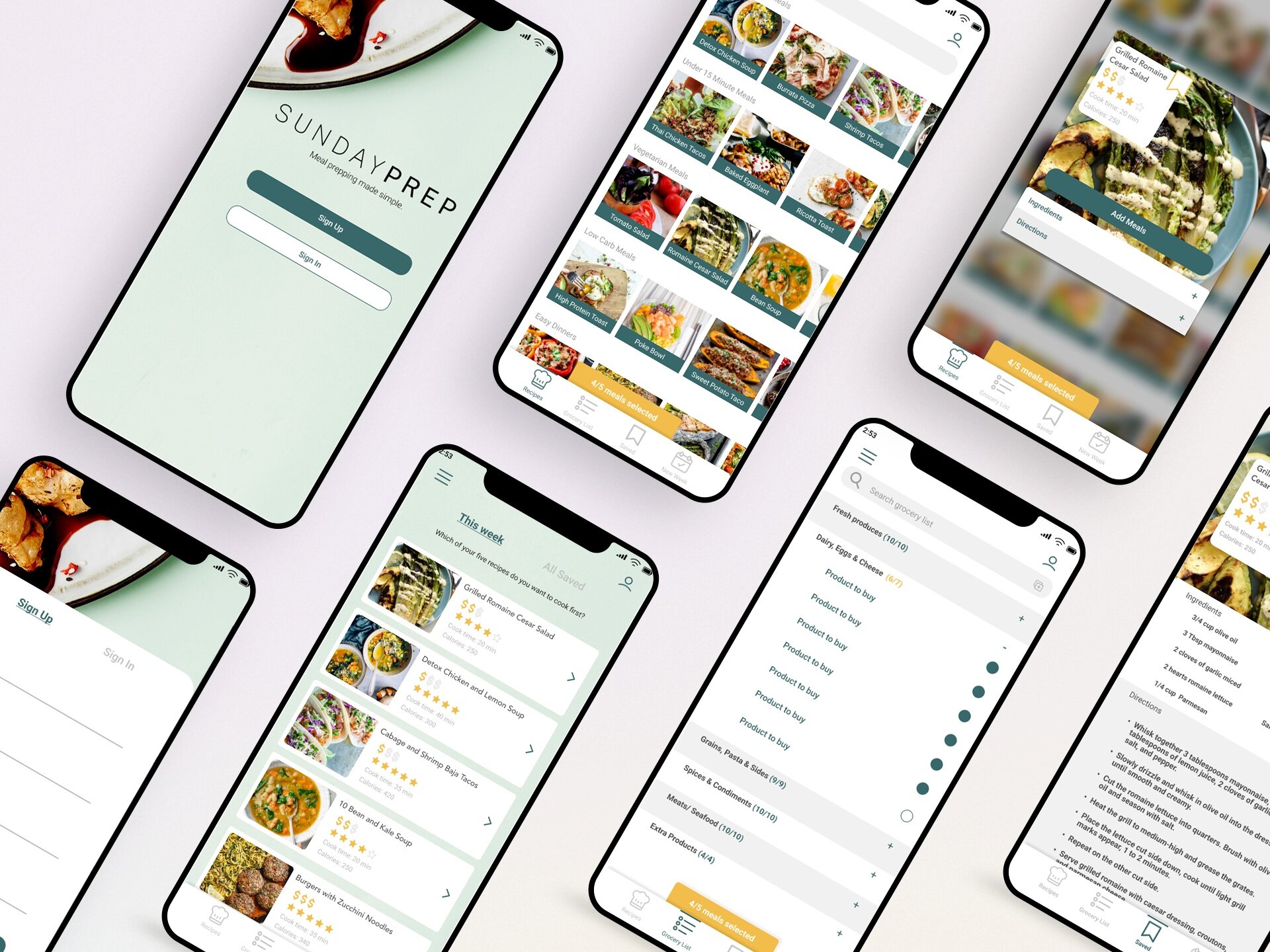
I was tasked with understanding why eating healthy can be challenging and to come up with a solution to those challenges.
Application must haves:
Login-in/sign up screen
Clear on-boarding process
Solution to why eating healthy is a challenge
Approach
The methods I used in this project were, one-on-one interviews, affinity mapping, journey mapping, user personas, sketching, wireframing, conducting a usability test, design the ui of the product, creating the mobile and tablet product then final usability testing.
When approaching this project I also followed the 5 stages of the Design-Thinking Process. The design thinking process is not as linear as it may seem; the steps overlap and repeat themselves to be extremely useful in finding the users' needs and testing throughout the process.
In conjunction with the Design-Thinking Process I implemented a UX Design Process which you will follow below in Process.

“Eating healthy is inconvenient”
— Quote from working millennial
PROCESS
EMPATHIZE
RESEARCH OUTCOMES
Survey
To understand why “eating healthy can be a challenge” I needed to learn more about WHY the working millennial specifically is struggling. I sent out a simple Google forms survey to my target audience. I wanted get a broad overview of what the working millennial’s pain points are, as well as their needs when factoring healthy eating into their busy lives. Highlighted statistics I learned from the survey sent out were that, 100% of working millennials agree that “Eating Healthy is a Challenge”, 83% of working millennials agrees they “Want to Cook More of Their Own Meals” and 67 of working millenials “Struggle to Find Healthy meals.” This survey ultimately led me to the decision to do on-one-on interviews vs a focus group interview because I wanted to get a deeper understanding individual working millennials struggles when trying to eat healthy.
One-on-one interviews
After getting a broad overview of working millennial’s pain points and needs of “Why Eating Healthy can be a Challenge", I dove deeper by conducting six one-on-one interviews. The goal of these interviews was to gather pivotal insights of the users' values, perceptions, and experiences. This was a crucial part of my research to begin affinity mapping.
I learned a majority of working millennials really struggle to eat healthy because of time and they don’t know what is healthy. They want to eat healthy but are overwhelmed when walking in the grocery store and seeing all of the options and unhealthy options staring back at them. A majority of Working millennials want to cook more meals at home during the work week but find going through a McDonalds drive through is much more convenient than trying to come up with a healthy meal and buying all of the necessary ingredients.
DEFINE
2. STRATEGY
Affinity Mapping
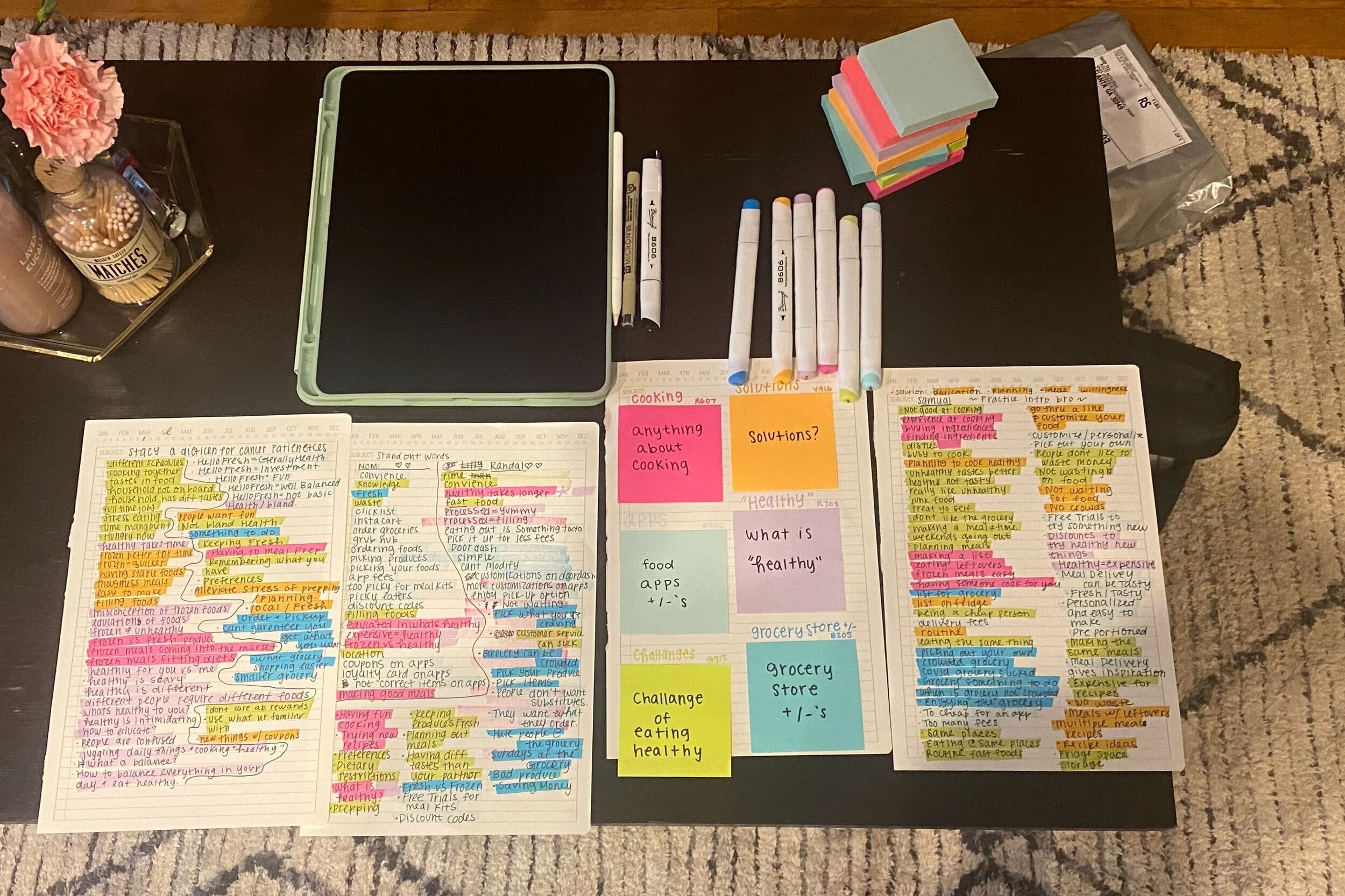
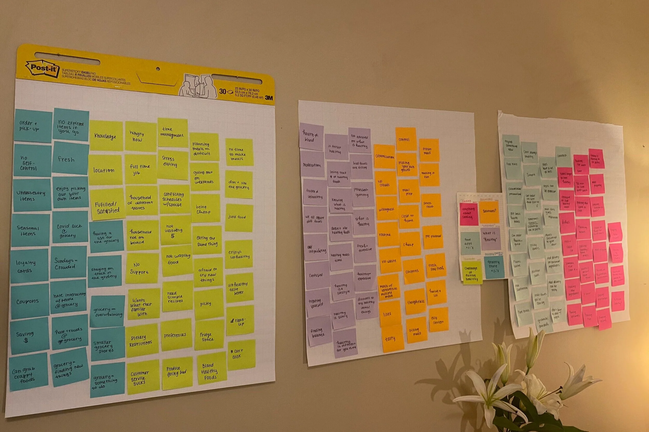
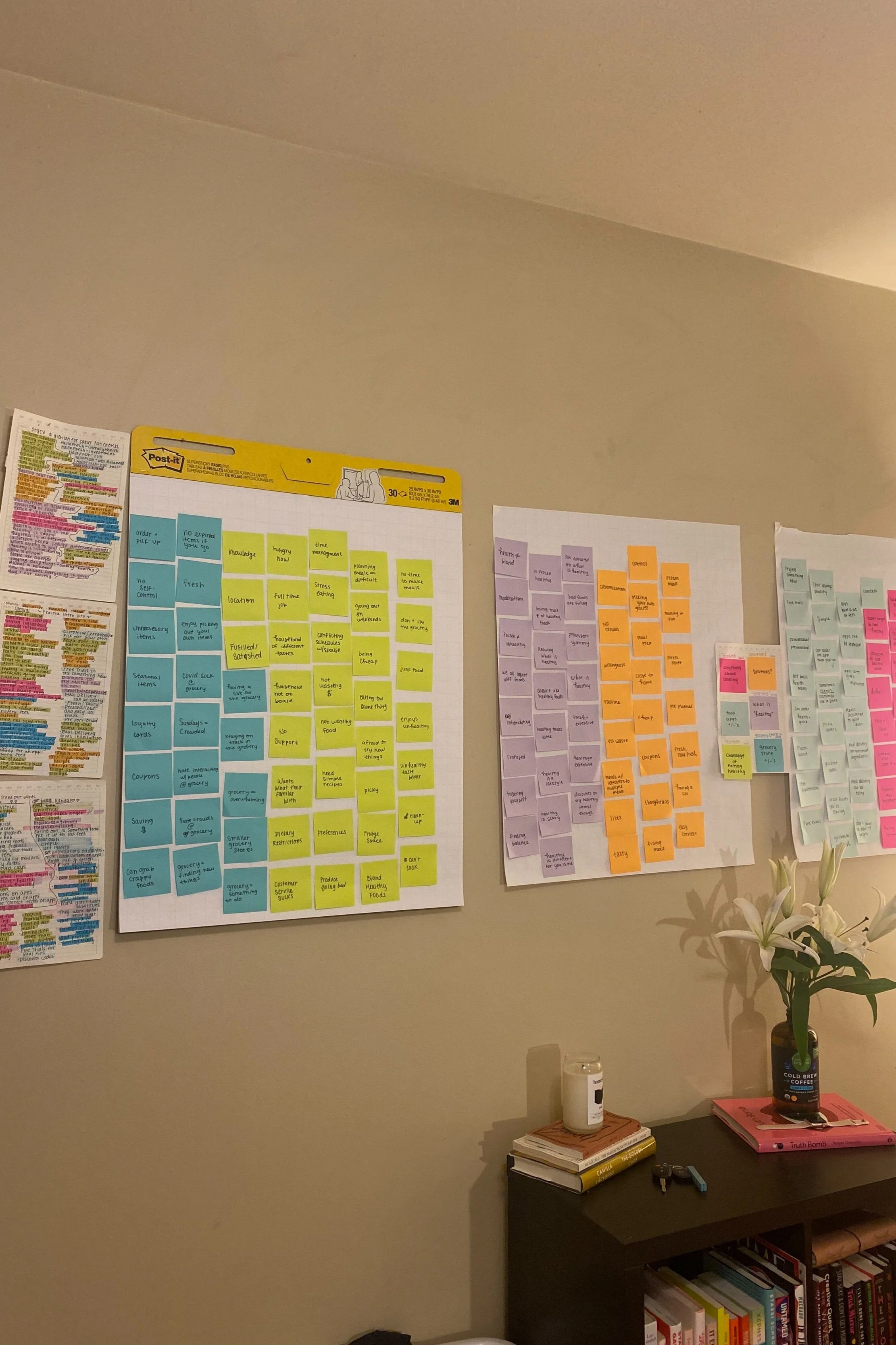
Affinity mapping was extremely helpful in my process. I gathered working millennials want to eat healthier even with their busy schedule but they want their solution to be easy something they can do on their time off, but it needs to be simple, all in one and easy to follow. With affinity mapping, I made an in-depth assessment of my research, then deciphered my research into themes (cooking, potential solutions, challenges, pros/cons of the grocery, “healthy” and food applications) which helped me draw out insights and determine the priorities of a solution. After affinity mapping, I was able to come up with a problem statement, “Our working millennial struggles to make healthy and tasty meals when they are cooking dinner each night. Our solution should deliver simple, delicious and healthy meals for working millennials to make that will having them forgetting about processed foods.”
User Needs
Based on information from insights during research, a user journey map and personas were created to reveal user needs and pain points to guide me in creating a design.
Journey Mapping
Journey mapping helped me do a deep dive into the working millennial’s journey when meal prepping, and helped me understand their feelings throughout the process. I went back to my one-on-one interviews to see how they would try to eat healthy and where their struggles where and where they would give up. This step helped me see where “Eating Healthy” becomes a challenge in the working millennials lives and how to make that experience more accessible for them. I saw that there is a lot of back and forth between applications and remembering steps, costing a lot of valuable time, so in my solution I want to streamline the “Eating Healthy” process for the working millennial.
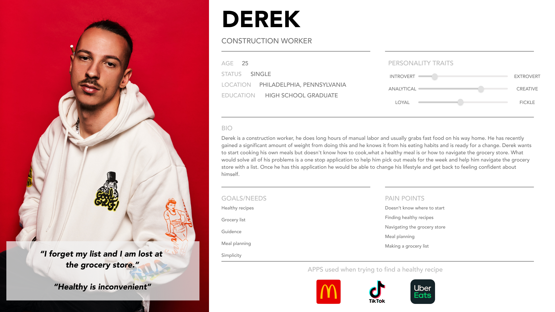
User Personas
User personas are archetypical users whose goals and characteristics represent the needs of a larger group of users. Creating personas helped me see my product from different target users' eyes that I wouldn’t see from my own biased perspective. I went back to my surveys and one-on-one interviews to create each persona to remember who I am designing for and why. By creating personas I began to really understand why working millennials were struggling to eat healthy by building an understanding of my users.
Pain Points
Too busy
Can’t find recipes
Healthy is boring
Doesn’t know where to start
Planning is too difficult
Wants / Needs
Easy to find meals
Easy grocery list
Meal planning
All in one product
Guidance
Healthy Recipes
Step by step, simple recipes
IDEATE
Sketching
Next, I began sketching with my user’s needs in mind. My goal was a solution that solves the working millennials biggest pain points when trying to eat healthy and accommodate their needs. I began sketching a meal prep product with easy, step-by-step instructions to create healthy meals for the week. I got inspiration from themes found during affinity mapping and quotes taken from notes while interviewing. Within one of my themes while affinity mapping a con of the grocery store was “always losing my list” said by multiple working millennials so I knew I wanted to incorporating adding a generated grocery list into my solution. Another big theme was “solution” within a solution was meal prepping. I was excited by this idea, because this went hand and hand with a grocery list, buying all your meals at once from a generated grocery list with all your meals for the week. Now it was time to sketch it out.
DESIGN
3. WIREFRAMING
After sketching I began creating lo-fidelity wireframes of the product, with the idea of the product being a meal prep application where the user can determine the number to meals they want to create that week, then select from a large catalog of healthy options. Once they have selected all their meals for the week, the application would create a sorted out grocery list of those items for the user.
PROTOTYPE / TEST
4. USABILITY TESTING
Once my lo-fidelity wireframes were complete I began user testing. I decided to do user testing with lo-fidelity wireframes so I could get an early reading of what was working with users. After testing I created a Usability Report to get an in-depth analysis into the users frustrations and expectations going into the product and make the proper adjustments going forward.
“In conclusion most participants saw themselves putting SundayPrep into their weekly routines. The participants found SundayPrep to be useful, easy to navigate and use, intuitive to follow, clean, and had everything you needed to do for weekly meal prepping in one central location. Implementing their recommendations and continuing to work with working millennials will ensure a continued user-centered website.”
After doing a usability test I went back to my product to make quite a few edits. I learned you have to guide the users through the product, edit the language throughout for a better understanding, always do spell check and modals are your friend. Once I added these I conducted another usability test. The product made much more sense with users.

* My AHA! moment
Conducting user testing was the pivotal moment in my process. I was concerned I wasn’t solving the real issues facing working millennials, this was a defining point to see if my idea was getting across to users, and it was. I felt clarity in this step hearing users feedback and creating a usability report to implement into the design.
5. FINAL UI
SundayPrep is designed to feel friendly, fresh, and motivating, designed with the user’s needs in mind throughout. From simple to use features, to a fresh and inviting color scheme that consists of simple tones specifically picked to guide the user’s eye through each step of planning a week of healthy meals.
6. FINAL PRODUCT
Three priority features
Users have the ability to select their weekly recipes from a large catalog sorted into various categories fitting their dietary preferences
Grocery list generated from recipes selected for that week, which is categorized to navigate the grocery store in an efficient manner
Application streamlines the meal prepping process; from picking a recipe to having all the ingredients for meals in one central location
Mobile Product
Tablet Product

“I could see myself incorporating SundayPrep into my weekly routine”
*Look Back
This was my first UX project so I learned a lot and am constantly coming back to this and updating it, but if I had more time on this project I would have taken more time affinity mapping to really dig out insights, pain points, wants and needs. In other projects I focused a lot of time and energy on affinity mapping to get myself organized and understand what users are missing and need in a product.
Also from this project I learned a lot about how to conduct user tests because this was my first time doing them. I found the more you practice the better you will be at conducting, as simple as that.


